Tuesday 18 March 2014

RPHC4002 Waste - First Test Shots

For my first set of test shots I decided to use my Nikon digital camera. First, I located a lady with two dogs sitting in a doorway. After introducing myself and explaining what I wanted to do, I took two shots. I am pleased with them, although they probably would have been better if they were closer so that you could read the expression in her eyes showing her despair. However, I wanted to make sure I got the dogs in the photo.

Next I located a man sat outside a shop. He was quite clearly drunk, but didn't mind when I asked if I could photograph him. I really like the pose of this one. He looks very relaxed with his legs straight out in front of him. It seems as though he is past caring about anything.

I took the both sets of images in colour. I then edited them so that they were black and white to create the feeling of being in the darker and sinister world they have to inhabit.  Overall, I am happy with both sets, but they could have been improved if there was less reflection in the glass behind the subjects. 


Sunday 16 March 2014

Unit RPHC4002 Waste - Further Research

For the next part of my research I have looked at two more photographers. Gillian Waring, a British photographer and Anthony Luvera, an Australian, based in London. They both photograph people but in different ways.


When Waring began putting together exhibitions, she decided to base them around the idea of photographing anonymous strangers in the street who she had asked to hold up a piece of paper with a message on it.   By allowing the stranger to write their thoughts on a piece of paper and be photographed, the disparities between public and private life is explored. Her portraits reveal an inconsistency, almost an absurdity, between what the person writes compared to the image they portray to strangers. 

For example, one photo shows a policeman who would automatically be seen as brave and fearless in his role, but has actually written ‘HELP’ on his paper. 


Another shows a man in a business suit looking confident and assured. Again, the image portrayed to a stranger would be a person who is confident and in charge of his life. However, the message ‘I’M DESPERATE’ tells what is really going on in his mind.


This may be an interesting approach to my photographs of the homeless.

Anthony Luvera’s approach is to photograph homeless people, but turning the camera on themselves to create an assisted self portrait.  

He believes that the space between the homelessness and the camera is where he locates his silent subjects. He sees homelessness as a changeable existence, fluid between one place and another without a voice or the possibility of being articulate. By turning the camera on themselves, Luvera offers a voice to homeless people. By moving the natural power balance found in portrait photography, Luvera shows that collaboration can create a more empathetic approach to photographing people. He has managed to build an archive through the eyes of people who have difficulty fitting in. 


His work has the power to educate people to the plight of the homeless. 

I feel this may be another approach that could work when I take my photographs. It should add a different dimension to the shot. 

Monday 10 March 2014

Comparison of Maurice Tabard’s Hand and Women with Distortion by Andre Kertsz


I have chosen to compare Maurice Tabard’s Hand and Women, 1929 with Andre Kertesz’s distortion work.  The image consists of a lady in white dress hiding her face behind a hand held mirror. It shows a dark figure next to her with a hand reaching round her as if to hold her waist. I feel this image has a strong sense of desire as the lady in the image has a very flattering desirable figure. When you look at the image you can feel that there is a tension between them. I think the viewer could feel slightly uncomfortable when looking at Hand and Women as there seems to be a dark side to the desire in this image. A notion of ambiguity and fantasy almost as though the hand is going to grab the lady.

The other work I have chosen to focus on is Distortion by Andre Kertsz 1933.  This distorted image of a lady laying on her side wearing no clothes is a powerful image. I feel Kertesz wanted to show that there is a blurred perception of how people see the female body. I believe this image has elements of fetishism as some people see this distorted body or figure as pleasing or attractive. She seems to be in a vulnerable position almost as though she is on display. He created these images using mirrors to show different ways of viewing what can be seen as ‘beautiful’. The image has a certain dramatic element to it but when you look at the ladies face she seems to be calm and peaceful looking. This could show that she is comfortable with herself and her body. I feel both images are showing the desirability of the female body both being represented in dark ways

Monday 3 March 2014


I have chosen to compare and contrast Daniel Riera’s ‘Vacation’ fashion photographs with Collier Schorr’s ‘Workshop’ series as I feel there are many similarities in the different factors that make these two fashion series.
‘Vacation’ is a fashion story for Fantastic Man magazine for the Sring/Summer collection in 2012. The models casted for this shoot all have a very masculine look with fit, bulky bodies. The narrative themes for this shoot are luxury vacations, the healthy body and style. The stylist used in this shoot is Jodie Barnes who has styled the models in a bold mix of Versace, DSquared2 and Addidas. The gestures in each shot show the models looking very confident with a relaxed attitude and happy expression. The outfits put together come across as very bold and luxurious. Although up to date with the current fashion its still a strange mix to team up the Versace outfits with the addidas sandals with socks, this I feel shows the careless, relaxed look to it. I feel Daniel Riera has wanted to go for a 50s feel in this shoot as the hairstyles are very classic. The location for this shoot is Palm Springs, this, I feel adds to the sense of luxury.


The other series I have chosen to look at is Collier Schorr’s fashion photographs called ‘Workshop’ for the Autumn/Winter collection 2013 also for Fantastic Man magazine. Luxury is also a key theme for his work but the models have a very different attitude and gesture to represent this. Casting models with an equally masculine and strong facial structured look they do not seem as relaxed or happy. The stylist has used a mix of Ralph Lauren, Gucci and Alexander McQueen styling them in bold colours and prints. The outfits in this series are a lot more formal and smart. I feel the models hair is also an important part of the look along with the strong jaw and serious expressions. 

Thursday 27 February 2014

Unit RPHC4002 Waste - Research

I already knew that photographing homeless people was something that needed to be done sensitively. However, my research made me realise that I have to be careful and realise I may be approaching someone who is not in their right mental state. Some may feel that they are being exploited by someone who may be seen as privileged and starting out on a career that they will probably not have the opportunity to take part in. They could even think I am building my career by exploiting them.

John Angulat wrote an article which included a sentence that I thought was very profound. He said ‘Homeless is a category, not a person.’


He also wrote a poem to accompany the following two image which he had taken, which is very thought provoking. 


If you passed her by on the street...

…Would you wish her a Merry Christmas?
…or take the time to chat?
Maybe even offer her half of your sandwich?
You know, she has a name.
She’s a person. She once had a life. 
Now she’s one of the forgotten.
At best, a curiosity we might surreptitiously photograph,
At worst, a blight we feel we should ignore.

She has a name.

“My name is Margaret” she told me, “but I used to be called…”
…she can’t remember.
I told her “That’s ok, I forget stuff too”.
She smiled, and ate my sandwich.


Unit RPHC4002 Waste Research

As I am taking photos of homeless people for my Waste project, I wanted to use my research to see how photographers capture the feelings of the homeless person through their shots. What seemed to come across with the work of the photographers I looked at was that they all take close ups. The focus on the eyes seems to capture the despair and desolation within the person.


I looked at Steve Huff whose images told exactly of the despair felt by this group of people. The cut to the face and the lack of care to the teeth portray the effects of homelessness. 


Lee Jeffries is another photographer of the homeless. He likes to connect with his subjects by gaining their trust first and also shows their despair through the eyes. He feels this is the most important element in telling the story of the image.  He does enhance his photos afterwards to achieve even more impact. He said in an interview: “I process, predominately through dodge and burn, to develop the mood of the eyes. It’s the eyes that attracted me to take the photograph in the first place and this is always the starting point for the emotional element of the image. I process with light and shadow in an almost religious way.”


All the images taken show similarities, the blackened skin where they have not been able to wash, overgrown facial hair, and quite often injuries of one type or another. All use close ups to achieve the effect they want to portray. The majority of the photographers I looked at use black and white film. I feel this has the effect of portraying the darker world they inhabit.


The similarities of dirty skin and overgrown facial hair are shown again in the following image by Michael Pharoah, but as he has used a colour film for this shot, it seems to give a softer feel to the image. 


Doing this research has made me realise how important it is going to be that some my shots need to be close up to get across the true feeling of  the desolation and waste of the subject’s life. I need to show the person’s emotions through their eyes in the same way of the photographers I looked at in my research.


Wednesday 26 February 2014

Fashion Materials for Shoot Outfits

 For the materials for the fashion shoot, Jade and I went into Rochester and found a textile shop. We looked through different fabrics and colours we can use for our outfits and picked out ones that will suit our Red Riding Hood theme. We also considered how these materials would photograph. We bought some metre long samples of them to use in our test shoots


Set Design and Test Shots

For the practice set design we first got together and spoke about the plan and how we want it to look. We also spoke about what we are going to need to make it and what the best material will be to use. We then planned how big it needs to be. Using polyboards we could see how this could be the walls of the bedroom. Then we had to make the bed out of tables and could see how this would look when covered for the final shoot. We used the stands to mark out where the trees will be, and worked out how many we need. We marked the floor with masking tape to work out how long the path will be and how wide. 

We decided the measurements need to be:
From back of bed to the end of the bed – 2.20m
Back wall from right to left – 2.20m
The width of bedroom on widest part – 3.20m
Length of forest – 5.80m
Width of forest – 5.40m
The widest part of the path – 1.5m
Width of path at the narrowest point – 50cm


For the lighting, we have decided to use a medium sized honeycomb grid for Red Riding Hood. We feel this will create the best light on her. From the back, we are going to use a lantern soft box to create a softer atmosphere when lighting up the bedroom. We are shooting on a 50mm lens because that allows the background to fit in, while still getting a full length shot of Red Riding Hood.
·         

       Test shots
·         Side shot of Red reading on bed – no trees included in shot
·         Shooting on 50mm lens to include background set and full length of Red
·         Second shot Red peering round tree (full length portrait with wolf in background – 50mm lens)
·         Third shot – Red picking up something off the path (landscape)
·         Possible shot, camera being on path – watching Red wander off
·         Other possible shots – down the path, full length shot of Red stepping into forest
·         Open back of set to take shot from inside of bedroom

·         Shot of Red looking scared, taken from across path, through the trees (possibly a close up with wolf shadow on the face) 

Friday 21 February 2014

Edited Test Shots for Waste Project


Unit RPHC4002 - Waste Research

As I am taking photos of homeless people for my Waste project, I wanted to use my research to see how photographers capture the feelings of the homeless person through their shots. What seemed to come across with the work of the photographers I looked at was that they all take close ups. The focus on the eyes seems to capture the despair and desolation within the person.


I looked at Steve Huff whose images told exactly of the despair felt by this group of people. The cut to the face and the lack of care to the teeth portray the effects of homelessness. 


Lee Jeffries is another photographer of the homeless. He likes to connect with his subjects by gaining their trust first and also shows their despair through the eyes. He feels this is the most important element in telling the story of the image.  He does enhance his photos afterwards to achieve even more impact. He said in an interview: “I process, predominately through dodge and burn, to develop the mood of the eyes. It’s the eyes that attracted me to take the photograph in the first place and this is always the starting point for the emotional element of the image. I process with light and shadow in an almost religious way.”


All the images taken show similarities, the blackened skin where they have not been able to wash, overgrown facial hair, and quite often injuries of one type or another. All use close ups to achieve the effect they want to portray. The majority of the photographers I looked at use black and white film. I feel this has the effect of portraying the darker world they inhabit.

The similarities of dirty skin and overgrown facial hair are shown again in the following image by Michael Pharoah, but as he has used a colour film for this shot, it seems to give a softer feel to the image. 

Doing this research has made me realise how important it is going to be that some my shots need to be close up to get across the true feeling of  the desolation and waste of the subject’s life. I need to show the person’s emotions through their eyes in the same way of the photographers I looked at in my research. 

Tuesday 18 February 2014

Unit RPHC4002 Waste - Test Shots

My test shoot began by visiting the High Street in the Medway. I found the subjects I was looking for sitting in shop doorways and between buildings. 

Unit RPHC4002 Waste My Initial Idea

Whereas one might automatically think of Waste as being household rubbish, I have decided to represent Waste by focusing on the waste of human life when people become homeless. Scarily, this can happen to anyone. Someone could lose their job and not be able to pay their mortgage or rent. Young people often leave home with no where else to go because of conflict with parents or step-parents. Some may leave an abusive relationship or leave the marital home as their relationship has broken down.

Although some might manage to find help to get them back on their feet, too often people find themselves sinking into a downward spiral of helplessness and hopelessness. Ill health sets in due to sleeping on the streets, boredom saps self confidence and  depression can take hold adding mental problems to physical problems.

I want to show how the subject of Waste can apply to humans. If there was more help available for people at the start of this downward journey, many lives could be kept on track.
   

So for my test shots, I shall take photos of people on the streets of the Medway. 

Tuesday 21 January 2014

RPHC4001 The Object and Body - (The Worker's Environment Shoot)

The Shoot in the Worker's Environment

The second part of this project is where I shot the librarian in her work environment. I decided not to use artificial light as there is a lot of daylight in the library. I took along a medium format Bronica and a tripod.

Although I didn’t want my model to pose too much as it was meant to be her working naturally in her environment, I did ask her to look straight into the camera while she was between the aisles. For some poses she had books in her hands.

Looking at the results of my shoot, I feel they have come out well as the light was perfect. However, if I was to do this again, I would try to make sure that the background came out better. I feel it is too green.

For the final research part of the project, I took my questionnaire along to a community library and the manager answered my questions.

Now that both parts of this project have been completed, I feel happy with my results, especially as I had to improvise with my model and location.

Overall, I felt my research supported my concept in that it made me realise how important props were to allow the viewer to understand the image. Even simple props can achieve this effect. I could improve next time by researching photographs which were related more to what I had chosen focus on.

I chose my final images for the reasons that the studio shot showed the meaning of my concept by the props my model was holding. The library shot was chosen as I felt the exposure was good, and as the subject was closer to the camera it seemed to work better. She also had books in her hand which added to the understanding of being in a library environment.

I feel I have kept up with my studies all through this task. I have done lots of research which helped me decide how I wanted my final shots to look.

I feel the biggest challenge for me on this task was contacting someone in the community and arranging for them to take part in this project. It was made more stressful in that, through no fault of my own, it didn’t come off. Luckily Adele in the uni library stepped in for me.I had no idea I was going to be let down as my original contacts were very enthusiastic. Next time, I should ensure the volunteer is committed and be more confident about pinning them down to a time.


RPHC4001 The Object and The Body - Part 2 Still Life - Photo Shoot

The Shoot

The Object shoot took place on Friday 29th November. First, I had to get the studio set up.

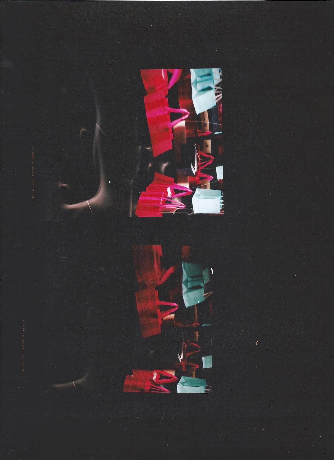
I decided to use mirrors to produce a distorted image of the bags and boxes. This was to create the illusion of how people can get a distorted view in their minds of having to have expensive designer products.

To get this effect, I had to bend the mirror board into a tube. Next, I hung the bags on thread and suspend them on a rod so that they looked as though they were floating in the middle of the tube. Then I placed two honeycomb lights to see which position would work best.

Next, I took a few practice shots on a digital camera to see what effect I would get. Two black poly boards were set up on the side so no other light could reflect on it.

When I found the best direction to shoot in, I set up the Horseman camera.  Then I did a practice shot to test that the focus and the aperture were right, after which I processed it and scanned the negative into the computer. I decided it was too dark so I changed the settings to make it lighter.

My research supports my concept as I looked at artists who were trying to make a point about consumerism. I found media reports which told of consumers who had got their obsession out of control.
I looked at photographers who reflected or distorted images which gave me ideas for how to portray the distorted images in the minds of these particular consumers.

Next time to improve my research, I could devise a questionnaire, take it to a shopping centre with designer shops and ask consumers about their shopping habits.

The images I chose were because they were more in focus which made the logos clearer.

My visual choices translate my ideas well as I wanted to create the illusion of how people can get a distorted view in their minds of having to have designer products and the mirror boards distorted my image.

I managed my studies well, even though the project was running alongside the Portrait project.  I spent a lot of time researching media articles, comments from consumers, artists and photographers.

I need to reflect that I should have thought a bit more about the props I needed for this shoot as it ended up being a bit stressful.