Tuesday 18 March 2014

RPHC4002 Waste - First Test Shots

For my first set of test shots I decided to use my Nikon digital camera. First, I located a lady with two dogs sitting in a doorway. After introducing myself and explaining what I wanted to do, I took two shots. I am pleased with them, although they probably would have been better if they were closer so that you could read the expression in her eyes showing her despair. However, I wanted to make sure I got the dogs in the photo.

Next I located a man sat outside a shop. He was quite clearly drunk, but didn't mind when I asked if I could photograph him. I really like the pose of this one. He looks very relaxed with his legs straight out in front of him. It seems as though he is past caring about anything.

I took the both sets of images in colour. I then edited them so that they were black and white to create the feeling of being in the darker and sinister world they have to inhabit.  Overall, I am happy with both sets, but they could have been improved if there was less reflection in the glass behind the subjects. 


Sunday 16 March 2014

Unit RPHC4002 Waste - Further Research

For the next part of my research I have looked at two more photographers. Gillian Waring, a British photographer and Anthony Luvera, an Australian, based in London. They both photograph people but in different ways.


When Waring began putting together exhibitions, she decided to base them around the idea of photographing anonymous strangers in the street who she had asked to hold up a piece of paper with a message on it.   By allowing the stranger to write their thoughts on a piece of paper and be photographed, the disparities between public and private life is explored. Her portraits reveal an inconsistency, almost an absurdity, between what the person writes compared to the image they portray to strangers. 

For example, one photo shows a policeman who would automatically be seen as brave and fearless in his role, but has actually written ‘HELP’ on his paper. 


Another shows a man in a business suit looking confident and assured. Again, the image portrayed to a stranger would be a person who is confident and in charge of his life. However, the message ‘I’M DESPERATE’ tells what is really going on in his mind.


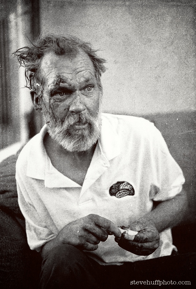
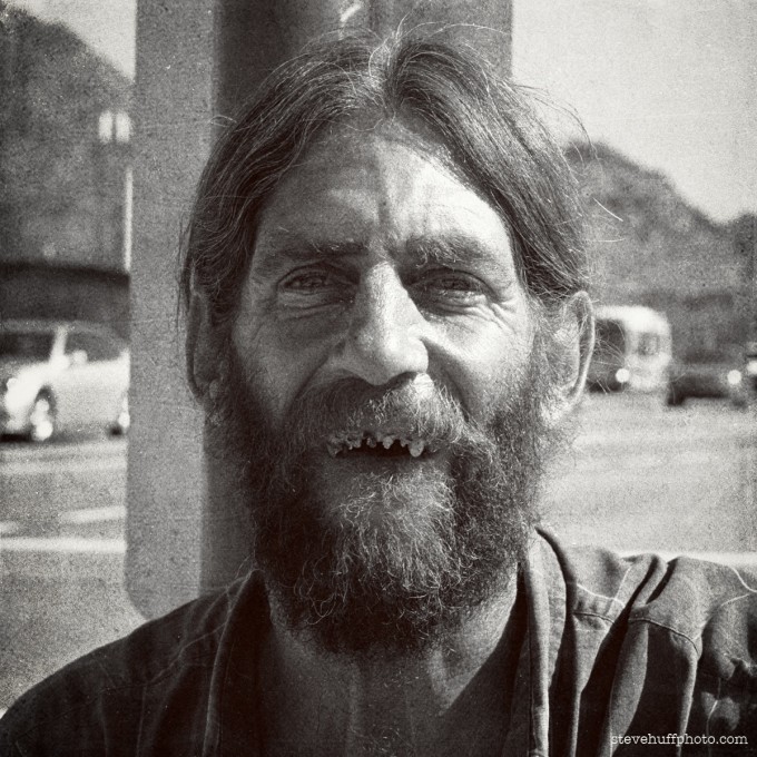
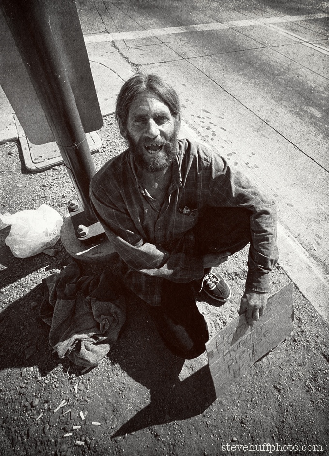
This may be an interesting approach to my photographs of the homeless.

Anthony Luvera’s approach is to photograph homeless people, but turning the camera on themselves to create an assisted self portrait.  

He believes that the space between the homelessness and the camera is where he locates his silent subjects. He sees homelessness as a changeable existence, fluid between one place and another without a voice or the possibility of being articulate. By turning the camera on themselves, Luvera offers a voice to homeless people. By moving the natural power balance found in portrait photography, Luvera shows that collaboration can create a more empathetic approach to photographing people. He has managed to build an archive through the eyes of people who have difficulty fitting in. 


His work has the power to educate people to the plight of the homeless. 

I feel this may be another approach that could work when I take my photographs. It should add a different dimension to the shot. 

Monday 10 March 2014

Comparison of Maurice Tabard’s Hand and Women with Distortion by Andre Kertsz


I have chosen to compare Maurice Tabard’s Hand and Women, 1929 with Andre Kertesz’s distortion work.  The image consists of a lady in white dress hiding her face behind a hand held mirror. It shows a dark figure next to her with a hand reaching round her as if to hold her waist. I feel this image has a strong sense of desire as the lady in the image has a very flattering desirable figure. When you look at the image you can feel that there is a tension between them. I think the viewer could feel slightly uncomfortable when looking at Hand and Women as there seems to be a dark side to the desire in this image. A notion of ambiguity and fantasy almost as though the hand is going to grab the lady.

The other work I have chosen to focus on is Distortion by Andre Kertsz 1933.  This distorted image of a lady laying on her side wearing no clothes is a powerful image. I feel Kertesz wanted to show that there is a blurred perception of how people see the female body. I believe this image has elements of fetishism as some people see this distorted body or figure as pleasing or attractive. She seems to be in a vulnerable position almost as though she is on display. He created these images using mirrors to show different ways of viewing what can be seen as ‘beautiful’. The image has a certain dramatic element to it but when you look at the ladies face she seems to be calm and peaceful looking. This could show that she is comfortable with herself and her body. I feel both images are showing the desirability of the female body both being represented in dark ways

Monday 3 March 2014


I have chosen to compare and contrast Daniel Riera’s ‘Vacation’ fashion photographs with Collier Schorr’s ‘Workshop’ series as I feel there are many similarities in the different factors that make these two fashion series.
‘Vacation’ is a fashion story for Fantastic Man magazine for the Sring/Summer collection in 2012. The models casted for this shoot all have a very masculine look with fit, bulky bodies. The narrative themes for this shoot are luxury vacations, the healthy body and style. The stylist used in this shoot is Jodie Barnes who has styled the models in a bold mix of Versace, DSquared2 and Addidas. The gestures in each shot show the models looking very confident with a relaxed attitude and happy expression. The outfits put together come across as very bold and luxurious. Although up to date with the current fashion its still a strange mix to team up the Versace outfits with the addidas sandals with socks, this I feel shows the careless, relaxed look to it. I feel Daniel Riera has wanted to go for a 50s feel in this shoot as the hairstyles are very classic. The location for this shoot is Palm Springs, this, I feel adds to the sense of luxury.


The other series I have chosen to look at is Collier Schorr’s fashion photographs called ‘Workshop’ for the Autumn/Winter collection 2013 also for Fantastic Man magazine. Luxury is also a key theme for his work but the models have a very different attitude and gesture to represent this. Casting models with an equally masculine and strong facial structured look they do not seem as relaxed or happy. The stylist has used a mix of Ralph Lauren, Gucci and Alexander McQueen styling them in bold colours and prints. The outfits in this series are a lot more formal and smart. I feel the models hair is also an important part of the look along with the strong jaw and serious expressions. 

Thursday 27 February 2014

Unit RPHC4002 Waste - Research

I already knew that photographing homeless people was something that needed to be done sensitively. However, my research made me realise that I have to be careful and realise I may be approaching someone who is not in their right mental state. Some may feel that they are being exploited by someone who may be seen as privileged and starting out on a career that they will probably not have the opportunity to take part in. They could even think I am building my career by exploiting them.

John Angulat wrote an article which included a sentence that I thought was very profound. He said ‘Homeless is a category, not a person.’


He also wrote a poem to accompany the following two image which he had taken, which is very thought provoking. 


If you passed her by on the street...

…Would you wish her a Merry Christmas?
…or take the time to chat?
Maybe even offer her half of your sandwich?
You know, she has a name.
She’s a person. She once had a life. 
Now she’s one of the forgotten.
At best, a curiosity we might surreptitiously photograph,
At worst, a blight we feel we should ignore.

She has a name.

“My name is Margaret” she told me, “but I used to be called…”
…she can’t remember.
I told her “That’s ok, I forget stuff too”.
She smiled, and ate my sandwich.


Unit RPHC4002 Waste Research

As I am taking photos of homeless people for my Waste project, I wanted to use my research to see how photographers capture the feelings of the homeless person through their shots. What seemed to come across with the work of the photographers I looked at was that they all take close ups. The focus on the eyes seems to capture the despair and desolation within the person.


I looked at Steve Huff whose images told exactly of the despair felt by this group of people. The cut to the face and the lack of care to the teeth portray the effects of homelessness. 


Lee Jeffries is another photographer of the homeless. He likes to connect with his subjects by gaining their trust first and also shows their despair through the eyes. He feels this is the most important element in telling the story of the image.  He does enhance his photos afterwards to achieve even more impact. He said in an interview: “I process, predominately through dodge and burn, to develop the mood of the eyes. It’s the eyes that attracted me to take the photograph in the first place and this is always the starting point for the emotional element of the image. I process with light and shadow in an almost religious way.”


All the images taken show similarities, the blackened skin where they have not been able to wash, overgrown facial hair, and quite often injuries of one type or another. All use close ups to achieve the effect they want to portray. The majority of the photographers I looked at use black and white film. I feel this has the effect of portraying the darker world they inhabit.


The similarities of dirty skin and overgrown facial hair are shown again in the following image by Michael Pharoah, but as he has used a colour film for this shot, it seems to give a softer feel to the image. 


Doing this research has made me realise how important it is going to be that some my shots need to be close up to get across the true feeling of  the desolation and waste of the subject’s life. I need to show the person’s emotions through their eyes in the same way of the photographers I looked at in my research.


Wednesday 26 February 2014

Fashion Materials for Shoot Outfits

 For the materials for the fashion shoot, Jade and I went into Rochester and found a textile shop. We looked through different fabrics and colours we can use for our outfits and picked out ones that will suit our Red Riding Hood theme. We also considered how these materials would photograph. We bought some metre long samples of them to use in our test shoots